
Style Notes
What Actually Makes a Watch Look Expensive
Price and presence are not the same thing. The details that read as "expensive" are cheaper than you think.
By the Tomi Lord Atelier · July 3, 2026 · 4 min read

Some watches cost a fortune and look it. Others cost a fortune and somehow don't. The gap between the two has almost nothing to do with the price tag — and everything to do with a handful of details that anyone can learn to read.
It's the finish, not the size
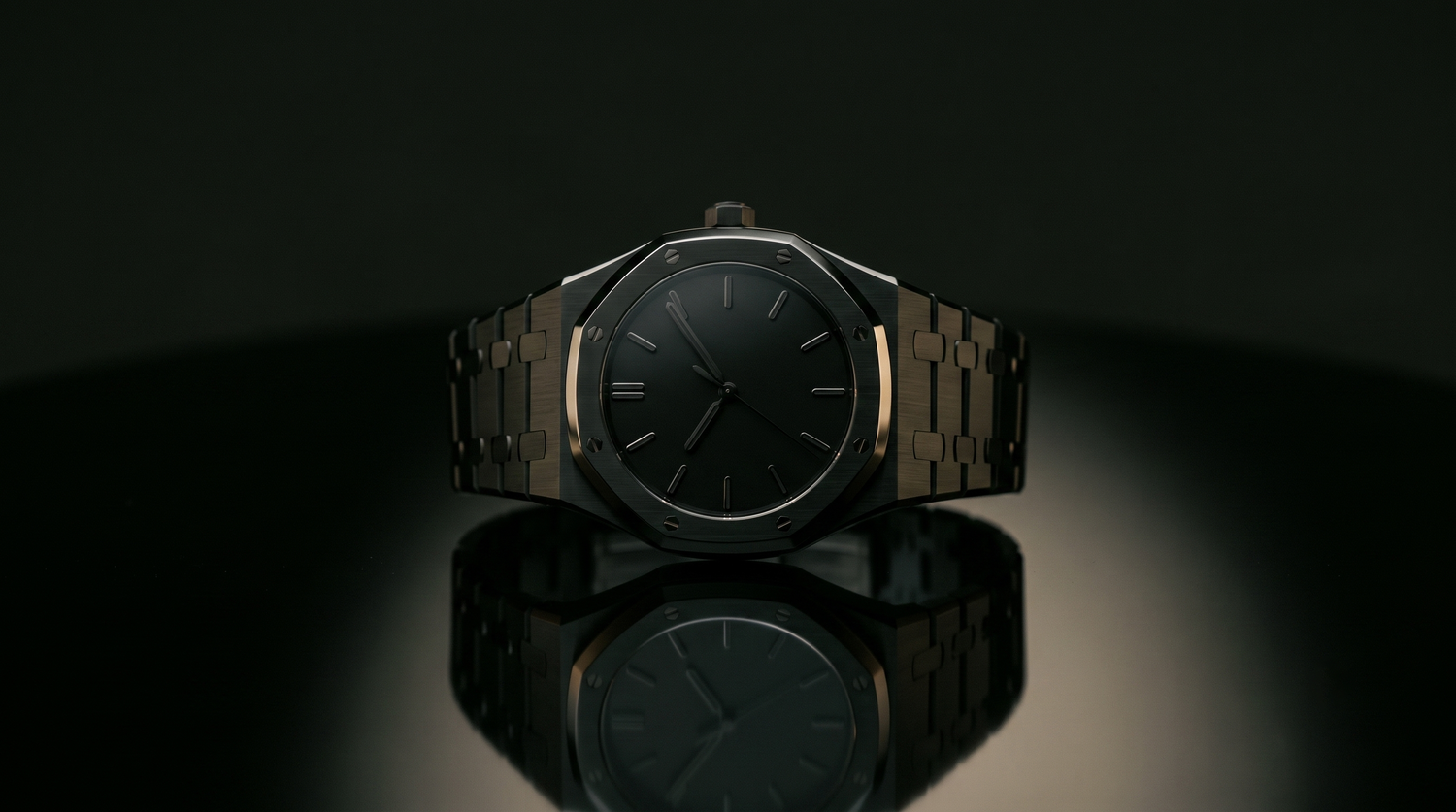
What the eye reads as "quality" is craftsmanship, not scale: clean lines, applied metal indices that catch the light, a well-proportioned case, a profile thin enough to slide under a cuff. An oversized, over-decorated watch shouts for attention — and shouting, on the wrist as anywhere, rarely reads as expensive.
Restraint reads as money
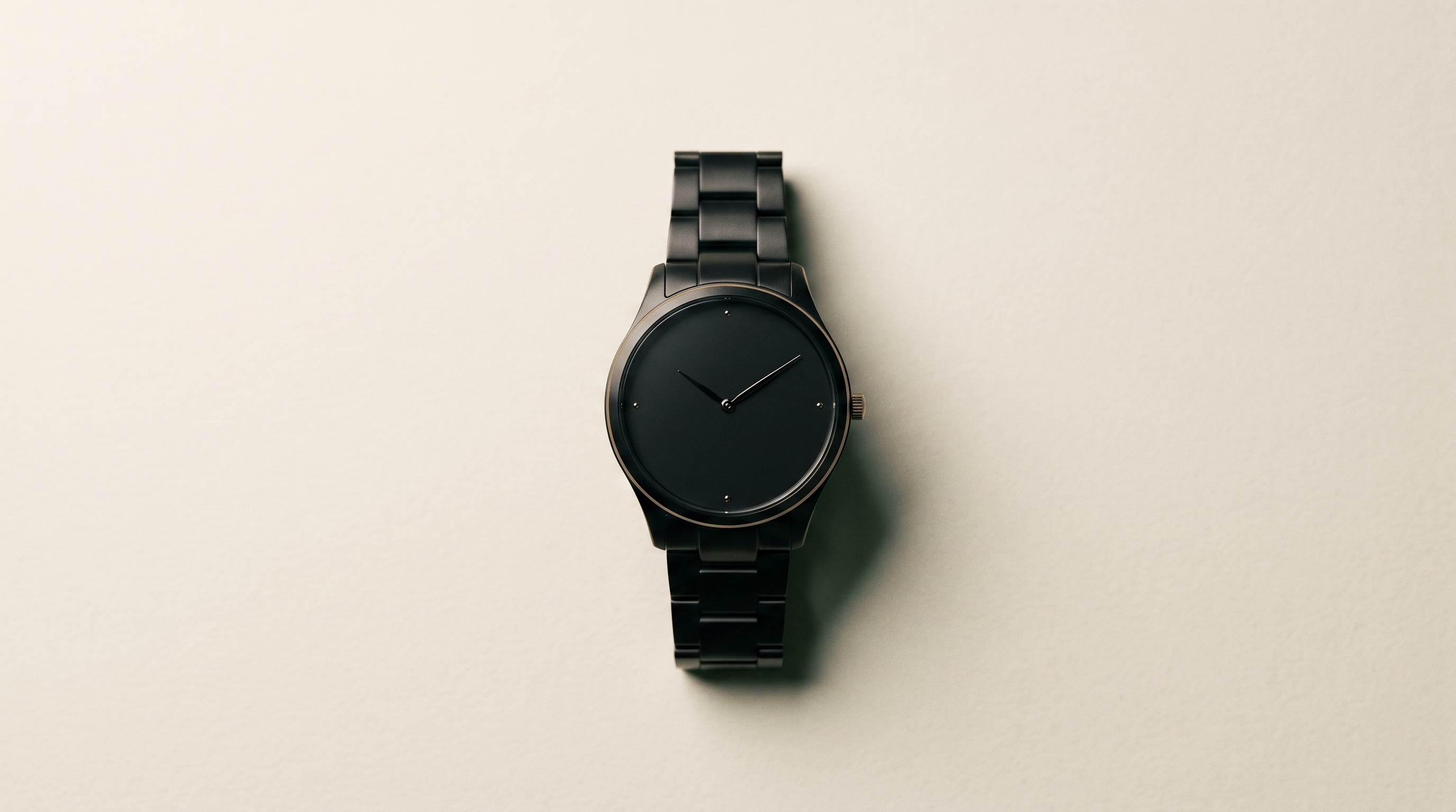
The most expensive-looking watches are almost always the quietest ones. A clean dial, a good strap, no clutter, no loud logo — just confidence in the design. It is the same instinct as a well-cut suit in a plain colour: the absence of noise is exactly what signals taste, and taste is what we mistake for money.
Expensive-looking is mostly restraint — the discipline to leave things off.
The tells of a cheap watch
Once you know what to look for, the giveaways are easy to spot: flat printed markers instead of applied ones, a chunky bezel, a busy dial crammed with text, and a logo doing more work than the design. Avoid those, choose proportion and restraint instead, and a modest watch can carry itself far above its price.
That look, without the fortune — Tomi Lord.
Explore the Collection →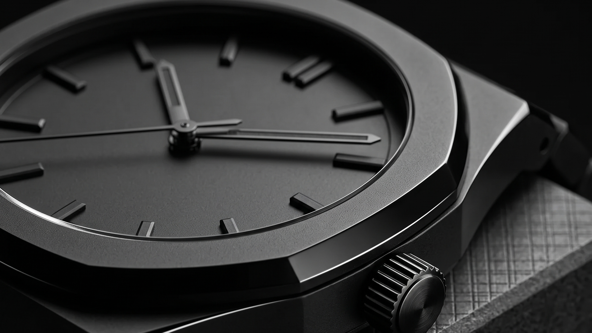
Leave a comment
This site is protected by hCaptcha and the hCaptcha Privacy Policy and Terms of Service apply.